Scheme File Introduction
Scheme files will determine what to do with your files within ./images/ and alter the aesthetic and operations of your theme. You’ll be able to change variables per program here such as;
- The alignment of the navigation buttons in the footer.
- Colour and transparency of all text + backgrounds.
- Positioning of text.
Hex Codes are 6 digit sequences that determine the colours of different elements.
Alpha Ranges from 0-255, with 0 being invisible and 255 being opaque.
Below you will find all the available attributes you can change in a scheme file, and explanations for every line.
Tip: Refer to the Theme Structure page to find the
muxprogramlist. Each individual page can have unique properties by creating another.inifile within the./scheme/folder with matching names to that program.
Scheme File Hierarchy
Multiple scheme files can be loaded for each screen in MustardOS. The files are loaded in an additive manner with each setting present in a scheme file overriding the previously read file settings. This allows for you to have a global file containing most of your theme settings in a centralised location and separate files with minimal settings to adjust resolution or screen specific settings.
| Scheme Path | Description |
|---|---|
/scheme/global.ini | Main scheme for your file. Settings in this file are for the entire theme regardless of resolution or screen. |
/{Resolution}/scheme/default.ini | Default scheme settings for this settings related to all screens for a specific resolution. For example changing CONTENT_ITEM_COUNT to a larger amount of items for specific resolutions. |
/{Resolution}/scheme/{module}.ini | Settings that only apply to a specific screen at a specific resolution. For example you may want to adjust CONTENT_WIDTH in a muxplore.ini file to allow room for displaying box art. |
Scheme File Line-By-Line
This is an example of a random ./scheme/default.ini file from the theme library.
Section [background]
| Setting | Description |
|---|---|
| BACKGROUND=000000 | Background colour. Most used in [list] gradients. |
| BACKGROUND_ALPHA=0 | Background colour transparency. |
| BACKGROUND_GRADIENT_COLOR=000000 | 2nd colour in gradient |
| BACKGROUND_GRADIENT_START=0 | Start point of gradient change. [BACKGROUND] changes to [BACKGROUND_GRADIENT_COLOR] colour. |
| BACKGROUND_GRADIENT_STOP=255 | End point of gradient change. |
| BACKGROUND_GRADIENT_DIRECTION=0 | Direction of gradient. 0 = None 1 = Vertical 2 = Horizontal |
| BACKGROUND_GRADIENT_DITHER=0 | Apply dithering effect to background gradient to help smooth out banding in the background gradient. 0 = Disabled 1 = Enabled |
| BACKGROUND_GRADIENT_BLUR=0 | Apply blur to background gradient. 0 = Disabled 1 or greater = Level of blur. |
Section [font]
| Setting | Description |
|---|---|
| FONT_HEADER_PAD_TOP=0 | Number of pixels from top of header area to header text. |
| FONT_HEADER_PAD_BOTTOM=0 | Number of pixels from bottom of header area to header text. |
| FONT_HEADER_ICON_PAD_TOP=0 | Number of pixels from top of header area to header icons. |
| FONT_HEADER_ICON_PAD_BOTTOM=0 | Number of pixels from bottom of header area to header icons. |
| FONT_FOOTER_PAD_TOP=0 | Number of pixels from top of footer area to footer text. |
| FONT_FOOTER_PAD_BOTTOM=0 | Number of pixels from bottom of footer area to footer text. |
| FONT_FOOTER_ICON_PAD_TOP=0 | Number of pixels from top of footer area to footer icons. |
| FONT_FOOTER_ICON_PAD_BOTTOM=0 | Number of pixels from bottom of footer area to footer icons. |
| FONT_MESSAGE_PAD_TOP=0 | Number of pixels from top of message area to message text. |
| FONT_MESSAGE_PAD_BOTTOM=0 | Number of pixels from bottom of message area to message text. |
| FONT_MESSAGE_ICON_PAD_TOP=0 | Number of pixels from top of message area to message icons. |
| FONT_MESSAGE_ICON_PAD_BOTTOM=0 | Number of pixels from bottom of message area to message icons. |
| FONT_LIST_PAD_TOP=0 | Number of pixels from top of a list item area to a list item text. |
| FONT_LIST_PAD_BOTTOM=0 | Number of pixels from bottom of an item area to a list item text. |
| FONT_LIST_PAD_LEFT=0 | Number of pixels from left of a list item area to a list item text. |
| FONT_LIST_PAD_RIGHT=0 | Number of pixels from right of an item area to a list item text. |
| FONT_LIST_ICON_PAD_TOP=0 | Number of pixels from top of a list item area to a list item glyph. |
| FONT_LIST_ICON_PAD_BOTTOM=0 | Number of pixels from bottom of an item area to a list item glyph. |
Note: By default text and glyphs in the header, footer, and list items will be centered vertically. It is recommended to start with a value of 0. Depending on the font used you may need to adjust the FONT_LIST_PAD_TOP or FONT_LIST_PAD_BOTTOM settings. FONT_LIST_PAD_TOP to move the text down and FONT_LIST_PAD_BOTTOM to move the text up. Do not use both settings at the same time.
Section [status]
| Setting | Description |
|---|---|
| ALIGN=1 | Alignment of header icons 0 = Left 1 = Right 2 = Center 3 = Icons spaced evenly across header 4 = icons evenly distributed with equal space around them 5 = First icon aligned left last icon aligned right all other icons evenly distributed |
| PADDING_LEFT=0 | Number of pixels of space to add to left side of the header icons. |
| PADDING_RIGHT=0 | Number of pixels of space to add to right side of the header icons. |
Section [battery]
| Setting | Description |
|---|---|
| BATTERY_NORMAL=000000 | Battery icon standard recolour . |
| BATTERY_ACTIVE=207d0e | On-charge battery icon recolour . |
| BATTERY_LOW=7d0e0e | Low battery icon recolour . |
| BATTERY_NORMAL_ALPHA=255 | Battery icon standard recolour transparency. |
| BATTERY_ACTIVE_ALPHA=255 | On-charge battery icon recolour transparency. |
| BATTERY_LOW_ALPHA=255 | Low battery icon recolour transparency. |
Section [network]
| Setting | Description |
|---|---|
| NETWORK_NORMAL=53422e | Disconnected network icon recolour . |
| NETWORK_ACTIVE=000000 | Connected network icon recolour . |
| NETWORK_NORMAL_ALPHA=255 | Disconnected network icon recolour transparency. |
| NETWORK_ACTIVE_ALPHA=255 | Connected network icon recolour transparency. |
Section [bluetooth]
| Setting | Description |
|---|---|
| BLUETOOTH_NORMAL=53422e | Disconnected bluetooth icon colour. Yet to be implemented. |
| BLUETOOTH_ACTIVE=000000 | Connected bluetooth icon colour. Yet to be implemented. |
| BLUETOOTH_NORMAL_ALPHA=255 | Disconnected bluetooth icon transparency. Yet to be implemented. |
| BLUETOOTH_ACTIVE_ALPHA=255 | Connected bluetooth icon transparency. Yet to be implemented. |
Section [date]
| Setting | Description |
|---|---|
| DATETIME_TEXT=000000 | Time text colour. |
| DATETIME_ALPHA=255 | Time text transparency. |
| DATETIME_ALIGN=1 | Alignment of time text 0 = Auto 1 = Left 2 = Center 3 = Right |
| PADDING_LEFT=0 | Number of pixels of space to add to left side of the time text. |
| PADDING_RIGHT=0 | Number of pixels of space to add to right side of the time text. |
Section [footer]
| Setting | Description |
|---|---|
| FOOTER_HEIGHT=42 | Adjust the height of the footer by pixels. |
| FOOTER_BACKGROUND=000000 | Footer area/background colour. |
| FOOTER_BACKGROUND_ALPHA=0 | Footer area/background transparency. |
| FOOTER_TEXT=000000 | Footer text colour, not including any navigation buttons. |
| FOOTER_TEXT_ALPHA=255 | Footer text transparency, not including any navigation buttons. |
Section [header]
| Setting | Description |
|---|---|
| HEADER_HEIGHT=42 | Adjust the height of the header by pixels. |
| HEADER_BACKGROUND=000000 | Header area/background colour. |
| HEADER_BACKGROUND_ALPHA=0 | Header area/background transparency. |
| HEADER_TEXT=000000 | Header text colour, not including time text. |
| HEADER_TEXT_ALPHA=255 | Header text transparency, not including time text. |
| HEADER_TEXT_ALIGN=2 | Alignment of header title text 0 = Auto 1 = Left 2 = Center 3 = Right |
| PADDING_LEFT=0 | Number of pixels of space to add to left side of the title text. |
| PADDING_RIGHT=0 | Number of pixels of space to add to right side of the title text. |
Section [help]
| Setting | Description |
|---|---|
| HELP_BACKGROUND=5d0014 | Help/info background window colour. |
| HELP_BACKGROUND_ALPHA=255 | Help/info background window transparency. |
| HELP_BORDER=ffe5b9 | Help/info window border colour. |
| HELP_BORDER_ALPHA=255 | Help/info window border transparency. |
| HELP_CONTENT=ffe5b9 | Help/info window standard text colour. |
| HELP_TITLE=ffe5b9 | Help/info window title text colour. |
| HELP_RADIUS=10 | Border roundness. 0 is a right angle. 10+ is very round. |
Section [navigation]
| Setting | Description |
|---|---|
| ALIGNMENT=1 | Regarding all navigation buttons in the footer. 0 = aligned to the left, 1 = central aligned, 2 = aligned to the right. Anything above is a secret. |
| NAV_A_GLYPH=000000 | The device’s “A” button - icon recolour . |
| NAV_A_GLYPH_ALPHA=255 | The device’s “A” button - icon transparency. |
| NAV_A_GLYPH_RECOLOUR_ALPHA=255 | The device’s “A” button - icon recolour transparency. |
| NAV_A_TEXT=000000 | Text describing the function of the “A” button - recolour . |
| NAV_A_TEXT_ALPHA=255 | Text describing the function of the “A” button - transparency. |
| NAV_B_GLYPH=000000 | The device’s “B” button - icon colour. |
| NAV_B_GLYPH_ALPHA=255 | The device’s “B” button - icon transparency. |
| NAV_B_GLYPH_RECOLOUR_ALPHA=255 | The device’s “B” button - icon recolour transparency. |
| NAV_B_TEXT=000000 | Text describing the function of the “B” button - recolour . |
| NAV_B_TEXT_ALPHA=255 | Text describing the function of the “B” button - transparency. |
| NAV_C_GLYPH=000000 | The device’s “C” button - icon colour. |
| NAV_C_GLYPH_ALPHA=255 | The device’s “C” button - icon transparency. |
| NAV_C_GLYPH_RECOLOUR_ALPHA=255 | The device’s “C” button - icon recolour transparency. |
| NAV_C_TEXT=000000 | Text describing the function of the “C” button - recolour . |
| NAV_C_TEXT_ALPHA=255 | Text describing the function of the “C” button - transparency. |
| NAV_X_GLYPH=000000 | The device’s “X” button - icon colour. |
| NAV_X_GLYPH_ALPHA=255 | The device’s “X” button - icon transparency. |
| NAV_X_GLYPH_RECOLOUR_ALPHA=255 | The device’s “X” button - icon recolour transparency. |
| NAV_X_TEXT=000000 | Text describing the function of the “X” button - recolour . |
| NAV_X_TEXT_ALPHA=255 | Text describing the function of the “X” button - transparency. |
| NAV_Y_GLYPH=000000 | The device’s “Y” button - icon colour. |
| NAV_Y_GLYPH_ALPHA=255 | The device’s “Y” button - icon transparency. |
| NAV_Y_GLYPH_RECOLOUR_ALPHA=255 | The device’s “Y” button - icon recolour transparency. |
| NAV_Y_TEXT=000000 | Text describing the function of the “Y” button - recolour . |
| NAV_Y_TEXT_ALPHA=255 | Text describing the function of the “Y” button - transparency. |
| NAV_Z_GLYPH=000000 | The device’s “Z” button - icon colour. |
| NAV_Z_GLYPH_ALPHA=255 | The device’s “Z” button - icon transparency. |
| NAV_Z_GLYPH_RECOLOUR_ALPHA=255 | The device’s “Z” button - icon recolour transparency. |
| NAV_Z_TEXT=000000 | Text describing the function of the “Z” button - recolour . |
| NAV_Z_TEXT_ALPHA=255 | Text describing the function of the “Z” button - transparency. |
| NAV_MENU_GLYPH=000000 | The device’s “M/MENU” button - icon colour. |
| NAV_MENU_GLYPH_ALPHA=255 | The device’s “M/MENU” button - icon transparency. |
| NAV_MENU_GLYPH_RECOLOUR_ALPHA=255 | The device’s “M/MENU” button - icon recolour transparency. |
| NAV_MENU_TEXT=000000 | Text describing the function of the “M” button - recolour . |
| NAV_MENU_TEXT_ALPHA=255 | Text describing the function of the “M” button - transparency. |
Section [grid]
Allows for displaying a grid of icons for the main menu or content explorer. Content Explorer will only be displayed for directories that only contain folders. You can disable grid view for a specific folder by adding an empty .nogrid text file to the root of the directory.
| Setting | Description |
|---|---|
| CURRENT_ITEM_LABEL_ALIGNMENT=9 | Label alignment: 1=Top Left 2=Top Middle 3=Top Right 4=Bottom Left 5=Bottom Middle 6=Bottom Right 7=Left Middle 8=Right Middle 9=Center |
| CURRENT_ITEM_LABEL_WIDTH=600 | Width of label. A value of 0 will size to content. |
| CURRENT_ITEM_LABEL_HEIGHT=0 | Height of label. A value of 0 will size to content. |
| CURRENT_ITEM_LABEL_OFFSET_X=0 | Horizontal offset based on CURRENT_ITEM_LABEL_ALIGNMENT. |
| CURRENT_ITEM_LABEL_OFFSET_Y=260 | Vertical offset based on CURRENT_ITEM_LABEL_ALIGNMENT. |
| CURRENT_ITEM_LABEL_RADIUS=10 | Add radius to label corners. 0 is a right angle. 10+ is very round. |
| CURRENT_ITEM_LABEL_BORDER_WIDTH=5 | Border width in pixels. |
| CURRENT_ITEM_LABEL_BORDER=FFFFFF | Label border colour. |
| CURRENT_ITEM_LABEL_BORDER_ALPHA=255 | Label border transparency. |
| CURRENT_ITEM_LABEL_BACKGROUND=000000 | Label background colour. |
| CURRENT_ITEM_LABEL_BACKGROUND_ALPHA=255 | Label background transparency. |
| CURRENT_ITEM_LABEL_TEXT=FFFFFF | Label text colour. |
| CURRENT_ITEM_LABEL_TEXT_ALPHA=255 | Label text transparency. |
| CURRENT_ITEM_LABEL_TEXT_ALIGNMENT=2 | Text horizontal alignment: 1=Left 2=Center 3=Right |
| CURRENT_ITEM_LABEL_TEXT_LINE_SPACING=0 | Amount of spacing between lines of text. Negative values can be used. |
| CURRENT_ITEM_LABEL_TEXT_PADDING_BOTTOM=10 | Amount of padding between bottom edge of label and text. |
| CURRENT_ITEM_LABEL_TEXT_PADDING_LEFT=10 | Amount of padding between left edge of label and text. |
| CURRENT_ITEM_LABEL_TEXT_PADDING_RIGHT=10 | Amount of padding between right edge of label and text. |
| CURRENT_ITEM_LABEL_TEXT_PADDING_TOP=10 | Amount of padding between top edge of label and text. |
| NAVIGATION_TYPE=2 | 2: Left/right/up/down navigation. Left/Right navigation at beginning or end of row moves to previous or next row. 4: Same as 2 except that left/right wraps around on the active row. |
| BACKGROUND=000000 | Grid main background colour. |
| BACKGROUND_ALPHA=0 | Grid main background transparency. |
| LOCATION_X=0 | Horizontal position of grid in pixels |
| LOCATION_Y=0 | Vertical position of grid in pixels |
| COLUMN_COUNT=0 | Number of columns |
| ROW_COUNT=0 | Number of rows displayed on screen at one time |
| ROW_HEIGHT=0 | Height in pixels of each row |
| COLUMN_WIDTH=0 | Width in pixels of each column |
| CELL_COLUMN_ALIGN=1 | Alignment of grid cell to column. 0 = Left 1 = Center 2 = Right |
| CELL_ROW_ALIGN=1 | Alignment of grid cell to row. 0 = Top 1 = Center 2 = Bottom |
| CELL_WIDTH=200 | Width of cell in pixels. Cell will be centered horizontally and vertically. |
| CELL_HEIGHT=200 | Height of cell in pixels. Cell will be centered horizontally and vertically. |
| CELL_RADIUS=10 | Add radius to cell corners. 0 is a right angle. 10+ is very round. |
| CELL_BORDER_WIDTH=5 | Cell border width in pixels. |
| CELL_IMAGE_PADDING_TOP=5 | Amount of padding between top edge of cell and cell image. Note: If text alpha is set to 0 image will be centered in the cell by default. |
| CELL_TEXT_PADDING_BOTTOM=5 | Amount of padding between bottom edge of cell and text label. |
| CELL_TEXT_PADDING_SIDE=5 | Amount of padding between edge of cell and text label. |
| CELL_TEXT_LINE_SPACING=0 | Adjust spacing between lines for text labels that wrap text. Negative values can be used to bring lines closer together. |
| CELL_SHADOW=000000 | Grid cell shadow colour |
| CELL_SHADOW_WIDTH=0 | Width in pixels of the shadow |
| CELL_SHADOW_X_OFFSET=10 | Horizontal offset in pixels of the shadow |
| CELL_SHADOW_Y_OFFSET=10 | Vertical offset in pixels of the shadow |
| CELL_DEFAULT_BACKGROUND=000000 | Unselected cell background colour. |
| CELL_DEFAULT_BACKGROUND_ALPHA=255 | Unselected cell background transparency. |
| CELL_DEFAULT_BACKGROUND_GRADIENT_COLOR=000000 | 2nd colour in gradient |
| CELL_DEFAULT_BACKGROUND_GRADIENT_START=0 | Start point of gradient change. [CELL_DEFAULT_BACKGROUND] changes to [CELL_DEFAULT_BACKGROUND_GRADIENT_COLOR] colour. |
| CELL_DEFAULT_BACKGROUND_GRADIENT_STOP=255 | End point of gradient change. |
| CELL_DEFAULT_BACKGROUND_GRADIENT_DIRECTION=0 | Direction of gradient. 0 = None 1 = Vertical 2 = Horizontal |
| CELL_DEFAULT_BORDER=000000 | Unselected cell border colour. |
| CELL_DEFAULT_BORDER_ALPHA=255 | Unselected cell border transparency. |
| CELL_DEFAULT_IMAGE_ALPHA=255 | Unselected cell image transparency. |
| CELL_DEFAULT_IMAGE_RECOLOUR=000000 | Unselected cell image recolour. |
| CELL_DEFAULT_IMAGE_RECOLOUR_ALPHA=0 | Unselected cell image recolour transparency. |
| CELL_DEFAULT_TEXT=000000 | Unselected cell text colour. |
| CELL_DEFAULT_TEXT_ALPHA=255 | Unselected cell text transparency. |
| CELL_FOCUS_BACKGROUND=000000 | Selected cell background colour. |
| CELL_FOCUS_BACKGROUND_ALPHA=255 | Selected cell background transparency. |
| CELL_FOCUS_BACKGROUND_GRADIENT_COLOR=000000 | 2nd colour in gradient |
| CELL_FOCUS_BACKGROUND_GRADIENT_START=0 | Start point of gradient change. [CELL_FOCUS_BACKGROUND] changes to [CELL_FOCUS_BACKGROUND_GRADIENT_COLOR] colour. |
| CELL_FOCUS_BACKGROUND_GRADIENT_STOP=255 | End point of gradient change. |
| CELL_FOCUS_BACKGROUND_GRADIENT_DIRECTION=0 | Direction of gradient. 0 = None 1 = Vertical 2 = Horizontal |
| CELL_FOCUS_BORDER=000000 | Selected cell border colour. |
| CELL_FOCUS_BORDER_ALPHA=255 | Selected cell border transparency. |
| CELL_FOCUS_IMAGE_ALPHA=255 | Selected cell image transparency. |
| CELL_FOCUS_IMAGE_RECOLOUR=000000 | Selected cell image recolour. |
| CELL_FOCUS_IMAGE_RECOLOUR_ALPHA=0 | Selected cell image recolour transparency. |
| CELL_FOCUS_TEXT=000000 | Selected cell text colour. |
| CELL_FOCUS_TEXT_ALPHA=255 | Selected cell text transparency. |
Section [list]
For all list item backgrounds, gradients can be applied. L-R = 0-255.
| Setting | Description |
|---|---|
| LIST_DEFAULT_RADIUS=0 | Background window border radius. 0 = square, 5+ = round. This applies setting applies to LIST_DEFAULT_BACKGROUND & LIST_FOCUS_BACKGROUND |
| LIST_DEFAULT_BACKGROUND=ececec | Unselected list item main background colour. |
| LIST_DEFAULT_BACKGROUND_ALPHA=0 | Unselected list item main background transparency. |
| LIST_DEFAULT_GRADIENT_START=0 | Start point of gradient change. [background] changes 2nd colour. |
| LIST_DEFAULT_GRADIENT_STOP=0 | End point of gradient change. |
| LIST_DEFAULT_GRADIENT_DIRECTION=0 | Direction of gradient. 0 = None 1 = Vertical 2 = Horizontal |
| LIST_DEFAULT_BORDER_WIDTH=5 | Unselected list item border width in pixels. |
| LIST_DEFAULT_BORDER_SIDE=4 | Unselected list item border sides. 0 = None 1 = Bottom 2 = Top 4 = Left 8 = Right Note: To do multiple sides add the values. For example to do top, bottom, left, and right you would add the 4 values together to get 15. |
| LIST_DEFAULT_INDICATOR=ececec | Unselected list item indicator/border colour. |
| LIST_DEFAULT_INDICATOR_ALPHA=0 | Unselected list item indicator/border transparency. |
| LIST_DEFAULT_TEXT=53422e | Unselected list item text colour. |
| LIST_DEFAULT_TEXT_ALPHA=255 | Unselected list item text transparency. |
| LIST_DEFAULT_GLYPH_PAD_LEFT=19 | Adjusts the padding in pixels from the left side of the list item to the center of the glyph.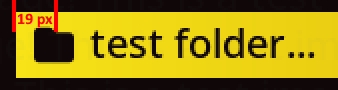 |
| LIST_DEFAULT_GLYPH_ALPHA=255 | List item glyph transparency |
| LIST_DEFAULT_GLYPH_RECOLOUR=53422e | Unselected list item glyph recolour. |
| LIST_DEFAULT_GLYPH_RECOLOUR_ALPHA=255 | Transparency of this colour. |
| LIST_DEFAULT_LABEL_LONG_MODE=1 | Long mode behavior for label text. 0 = Wrap long lines 1 = Show elipse when unselected. Scroll text when item selected. |
| LIST_DISABLED_TEXT=a78b65 | Unavailable list item text colour. |
| LIST_DISABLED_TEXT_ALPHA=255 | Unavailable list item text transparency. |
| LIST_FOCUS_BACKGROUND=000000 | Selected list item main background colour. |
| LIST_FOCUS_BACKGROUND_ALPHA=0 | Selected list item main background transparency. |
| LIST_FOCUS_GRADIENT_START=0 | Start point of gradient change. [background] changes 2nd colour. |
| LIST_FOCUS_GRADIENT_STOP=0 | End point of gradient change. |
| LIST_FOCUS_GRADIENT_DIRECTION=0 | Direction of gradient. 0 = None 1 = Vertical 2 = Horizontal |
| LIST_FOCUS_BORDER_WIDTH=5 | Selected list item border width in pixels. |
| LIST_FOCUS_BORDER_SIDE=4 | Selected list item border sides. 0 = None 1 = Bottom 2 = Top 4 = Left 8 = Right Note: To do multiple sides add the values. For example to do top, bottom, left, and right you would add the 4 values together to get 15. |
| LIST_FOCUS_INDICATOR=5d0014 | Selected list item indicator/border colour. |
| LIST_FOCUS_INDICATOR_ALPHA=255 | Selected list item indicator/border transparency. |
| LIST_FOCUS_TEXT=5d0014 | Selected list item text colour. |
| LIST_FOCUS_TEXT_ALPHA=255 | Selected list item text transparency. |
| LIST_FOCUS_GLYPH_ALPHA=255 | Selected List item glyph transparency. |
| LIST_FOCUS_GLYPH_RECOLOUR=5d0014 | Selected list item glyph recolour. |
| LIST_FOCUS_GLYPH_RECOLOUR_ALPHA=255 | Transparency of this colour. |
Section [image_list]
Alters properties of list images.
| Setting | Description |
|---|---|
| IMAGE_LIST_ALPHA=255 | Image transparency |
| IMAGE_LIST_RADIUS=3 | Image window radius. 0 = no change. 10+ = heavily rounded window. |
| IMAGE_LIST_RECOLOUR=ad0000 | Image recolour. |
| IMAGE_LIST_RECOLOUR_ALPHA=0 | Transparency of this colour. |
| IMAGE_LIST_PAD_TOP=0 | Number of pixels of space to add to top side of the image. |
| IMAGE_LIST_PAD_BOTTOM=0 | Number of pixels of space to add to bottom side of the image. |
| IMAGE_LIST_PAD_LEFT=0 | Number of pixels of space to add to left side of the image. |
| IMAGE_LIST_PAD_RIGHT=0 | Number of pixels of space to add to right side of the image. |
| IMAGE_PREVIEW_ALPHA=255 | Preview image transparency |
| IMAGE_PREVIEW_RADIUS=3 | Image window radius. 0 = no change. 10+ = heavily rounded window. |
| IMAGE_PREVIEW_RECOLOUR=ad0000 | Image recolour. |
| IMAGE_PREVIEW_RECOLOUR_ALPHA=0 | Transparency of this colour. |
Section [charging]
When placed on charge without booting, the charging screen will appear.
| Setting | Description |
|---|---|
| CHARGER_BACKGROUND=100808 | Charging banner background colour. |
| CHARGER_BACKGROUND_ALPHA=0 | Charging banner background transparency. |
| CHARGER_TEXT=000000 | Charging banner text colour. |
| CHARGER_TEXT_ALPHA=255 | Charging banner text transparency. |
| CHARGER_Y_POS=100 | Position of the banner from the centre. -100 is up, 100 is down. |
Section [keyboard]
| Setting | Description |
|---|---|
| OSK_BACKGROUND=5d0014 | On-screen keyboard background window colour. |
| OSK_BACKGROUND_ALPHA=255 | On-screen keyboard background window transparency. |
| OSK_BORDER=ffe5b9 | On-screen keyboard background window border colour. |
| OSK_BORDER_ALPHA=255 | On-screen keyboard background window border transparency. |
| OSK_RADIUS=10 | Background window border radius. 0 = square, 5+ = round. |
| OSK_TEXT=ffe5b9 | Unselected and inputted text colour. |
| OSK_TEXT_ALPHA=255 | Unselected and inputted text transparency. |
| OSK_TEXT_FOCUS=ffe5b9 | Selected text colour. |
| OSK_TEXT_FOCUS_ALPHA=255 | Selected text transparency. |
| OSK_ITEM_BACKGROUND=000000 | Unselected text background / button colour. |
| OSK_ITEM_BACKGROUND_ALPHA=50 | Unselected text background / button transparency. |
| OSK_ITEM_BACKGROUND_FOCUS=000000 | Selected text background / button colour. |
| OSK_ITEM_BACKGROUND_FOCUS_ALPHA=150 | Selected text background / button transparency. |
| OSK_ITEM_BORDER=c0c0c0 | Unselected text button border colour. |
| OSK_ITEM_BORDER_ALPHA=0 | Unselected text button border transparency. |
| OSK_ITEM_BORDER_FOCUS=ffe5b9 | Selected text button border colour. |
| OSK_ITEM_BORDER_FOCUS_ALPHA=255 | Selected text button border transparency. |
| OSK_ITEM_RADIUS=5 | All button border radius. 0 = square, 5+ = round. |
Section [notification]
| Setting | Description |
|---|---|
| MSG_BACKGROUND=5d0014 | Pop-up message background colour. |
| MSG_BACKGROUND_ALPHA=255 | Pop-up message background transparency. |
| MSG_BORDER=ffe5b9 | Pop-up message window border colour. |
| MSG_BORDER_ALPHA=255 | Pop-up message window border transparency. |
| MSG_RADIUS=10 | Pop-up message window border roundness. 0 = square, 5+ = round. |
| MSG_TEXT=ffe5b9 | Pop-up message text colour. |
| MSG_TEXT_ALPHA=255 | Pop-up message text transparency. |
Section [bar]
This is the horizontal bar showing volume/brightness.
| Setting | Description |
|---|---|
| BAR_WIDTH=615 | Background of the bar window - width. |
| BAR_HEIGHT=5d0014 | Background of the bar window - height. |
| BAR_BACKGROUND=5d0014 | Background of the bar window - colour. |
| BAR_BACKGROUND_ALPHA=255 | Background of the bar window - transparency. |
| BAR_BORDER=ffe5b9 | Bar window border colour. |
| BAR_BORDER_ALPHA=255 | Bar window border transparency. |
| BAR_RADIUS=10 | Bar window border roundness. 0 = square, 5+ = round. |
| BAR_PROGRESS_WIDTH=550 | Inactive section of the progress bar - width. |
| BAR_PROGRESS_HEIGHT=16 | Inactive section of the progress bar - height. |
| BAR_PROGRESS_BACKGROUND=000000 | Inactive section of the progress bar - colour. |
| BAR_PROGRESS_BACKGROUND_ALPHA=255 | Inactive section of the progress bar - transparency. |
| BAR_PROGRESS_ACTIVE_BACKGROUND=ffe5b9 | Active section of the progress bar - colour. |
| BAR_PROGRESS_ACTIVE_BACKGROUND_ALPHA=255 | Active section of the progress bar - transparency. |
| BAR_PROGRESS_RADIUS=3 | Progress bar roundness. 0 = square, 5+ = round. |
| BAR_ICON=ffe5b9 | Bar icon/glyph colour. Volume/brightness symbol. |
| BAR_ICON_ALPHA=255 | Bar icon transparency. Volume/brightness symbol. |
| BAR_Y_POS=384 | Vertical position of the bar from the top. |
Section [roll]
This relates to the passcode/lock screen when enabled in settings.
| Setting | Description |
|---|---|
| ROLL_TEXT=53422e | Unselected passcode text colour. |
| ROLL_TEXT_ALPHA=255 | Unselected passcode text transparency. |
| ROLL_BACKGROUND=fbfbfb | Unselected passcode background / button colour. |
| ROLL_BACKGROUND_ALPHA=255 | Unselected passcode background / button transparency. |
| ROLL_RADIUS=10 | Unselected passcode button border radius. |
| ROLL_SELECT_TEXT=000000 | Selected passcode text colour. |
| ROLL_SELECT_TEXT_ALPHA=255 | Selected passcode text transparency. |
| ROLL_SELECT_BACKGROUND=000000 | Selected passcode background / button colour. |
| ROLL_SELECT_BACKGROUND_ALPHA=50 | Selected passcode background / button transparency. |
| ROLL_SELECT_RADIUS=10 | Selected passcode button border radius. |
| ROLL_BORDER_COLOUR=53422e | Window border colour. |
| ROLL_BORDER_ALPHA=255 | Window border transparency. |
| ROLL_BORDER_RADIUS=10 | Window border roundness. 0 = square, 5+ = round. |
Section [counter]
| Setting | Description |
|---|---|
| COUNTER_ALIGNMENT=2 | 0 = aligned to the left, 1 = central aligned, 2 = aligned to the right. |
| COUNTER_PADDING_AROUND=10 | Number of pixels around the text of the counter. |
| COUNTER_PADDING_SIDE=5 | Number of pixels to move the counter from the side of the screen. Only used with left and right alignments |
| COUNTER_PADDING_TOP=50 | Number of pixels from screen top to place the counter. |
| COUNTER_BORDER_COLOUR=c69200 | Border colour. |
| COUNTER_BORDER_ALPHA=255 | Border transparency. |
| COUNTER_BORDER_WIDTH=2 | Border width in pixels. |
| COUNTER_RADIUS=3 | Border roundness. 0 is a right angle. 10+ is very round. |
| COUNTER_BACKGROUND=100808 | Counter area/background colour. |
| COUNTER_BACKGROUND_ALPHA=255 | Counter area/background transparency. |
| COUNTER_TEXT=ffffff | Counter text colour. |
| COUNTER_TEXT_ALPHA=255 | Counter text transparency. |
| COUNTER_TEXT_FADE_TIME=50 | Used to gradually fade out the counter when screen activity is idle. A value of 0 will disable the setting. |
| COUNTER_TEXT_SEPARATOR= of | Separator in between the current item index and the number of items in the list. Default value “ of “ which would display as “1 of 50”. |
Section [meta]
| Setting | Description |
|---|---|
| META_CUT=40 | Number of characters on each line in help/info windows before making a new one. |
Section [terminal]
| Setting | Description |
|---|---|
| FOREGROUND=FFFFFF | Font colour of terminal window |
| BACKGROUND=000000 | Background colour of terminal window |
Section [verbose]
| Setting | Description |
|---|---|
| VERBOSE_BOOT_BACKGROUND=000000 | Background colour of verbose boot messages. |
| VERBOSE_BOOT_BACKGROUND_ALPHA=255 | Background colour transparency. |
| VERBOSE_BOOT_TEXT=FFFFFF | Text colour of verbose boot messages. |
| VERBOSE_BOOT_TEXT_ALPHA=255 | Text colour transparency. |
| VERBOSE_BOOT_Y_POS=165 | Vertical position of verbose boot messages in pixels. |
Section [misc]
| Setting | Description |
|---|---|
| RANDOM_BACKGROUND=0 | If set to 1 randomly select background image based on PNG sequence. Uses the naming convention {programname}.{Index}.png for example to have the background for muxlaunch randomly selected you would name the images: muxlaunch.0.png, muxlaunch.1.png, muxlaunch.2.png… |
| CONTENT_SIZE_TO_CONTENT=0 | Resizes list items to fit text of item. If enabled CONTENT_WIDTH will be used as a max width. |
| CONTENT_ALIGNMENT=0 | Alignment of list item. 0=Left, 1=Center, 2=Right. CONTENT_PADDING_LEFT can be used to adjust postion. Negative value to shift items left, positive value to shift items right. |
| CONTENT_ITEM_COUNT=13 | Number of list items displayed in content panel. This setting along with CONTENT_HEIGHT to determine the height of each item. For example if CONTENT_HEIGHT = 300 and CONTENT_ITEM_COUNT = 10 then each item will be 30px tall. The first 28px will be used to display the item followed by a 2px gap. Note: This field has a minimum value of 5 and a maximum value of 13. The value set here also controls paging up and down in the list. |
| CONTENT_ITEM_HEIGHT=0 | Sets a static height for each list item. If used number of items will be calculated based CONTENT_HEIGHT size. Note: Should only be used if not using CONTENT_ITEM_COUNT |
| CONTENT_PADDING_LEFT=0 | Number of pixels from screen left to list items. Commonly on 0. |
| CONTENT_PADDING_TOP=0 | Number of pixels from screen top to list items. Note: By default the list is positioned based on header height + 2px. With a default header height of 42px the list will start 44px from the top in order for it to be past the header. If you want the content list to take up the full screen you can use a value of -44 here. If your header height is larger you would need to adjust accordingly. |
| CONTENT_HEIGHT=392 | Adjust the height of the content panel by pixels. (Minimum value = 100 Maximum value = Device Screen Height) |
| CONTENT_WIDTH=640 | Adjust the width of list item content by horizontal pixels. |
| NAVIGATION_TYPE=0 | 0: For vertical (up/down) navigation. 1: For horizontal (left/right). 2: For launch menu with two rows of 4 icons. (left/right/up/down) 3: For launch menu with two rows of icons. Top row has 3 icons and bottom row has 5 icons. (left/right/up/down) 4: Same as 2 except that left/right wraps around on the active row. 5: Same as 3 except that left/right wraps around on the active row. |
| STATIC_ALIGNMENT=0 | Controls layering and position of static images with other elements. See below for details. |
| IMAGE_OVERLAY=0 | Do you want to use an overlay .png image? 0 is no. 1 is yes. |
| ANTIALIASING=1 | Apply atialieasing to fonts 0 = Disabled 1 = Enabled |
Static Alignment Values
- Describes the layering and position of static images with other elements.
- Place static images in ./images/static/ named similarly to wall images.
- You can use default.png as a static fallback image.
- You can use static images for individual list items and programs.
| Value | Description |
|---|---|
| 0 | Bottom Right (Just above the footer) |
| 1 | Middle Right |
| 2 | Top Right (Just below the header) |
| 3 | Fullscreen - behind header and footer |
| 4 | Fullscreen - above header and footer |